Changelog

Follow new updates and improvements to HeroUI v3.

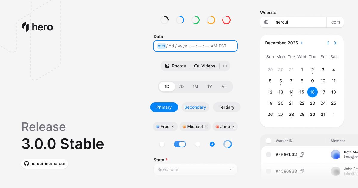
HeroUI v3 is officially stable and Pro pre-sale is live

HeroUI v3 is out of beta. It's stable, it's ready, and it's the biggest release we've ever shipped.

Here's what changed:

  • Built on Tailwind CSS v4 and React Aria Components

  • CSS-powered animations — no more Framer Motion dependency

  • Compound components — compose what you need, skip what you don't

  • Semantic variants (primary, secondary, tertiary) instead of visual ones

  • Styles separated from logic — use with React, plain HTML, or anything else

  • Fully typed, tree-shakeable, React 19 ready

This isn't a theme update from v2. It's a ground-up rebuild of every component, every API, every design decision.

Get started: https://heroui.com


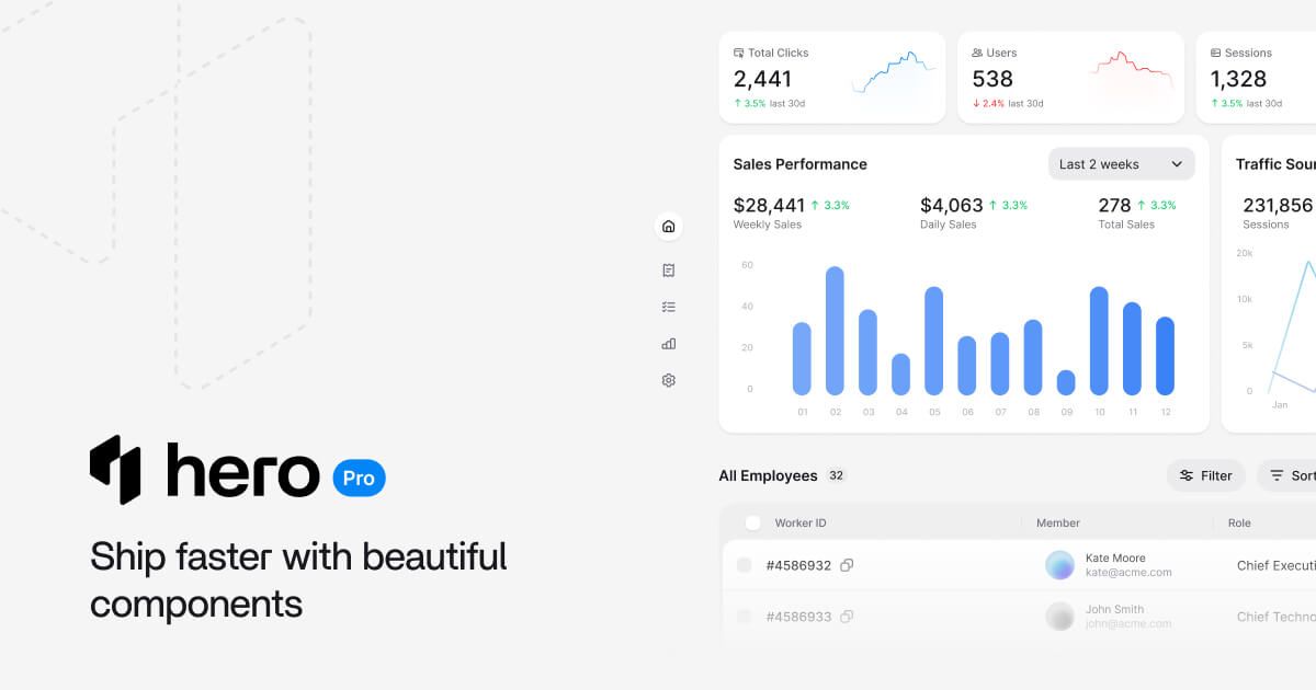
One more thing — HeroUI Pro v3 is in pre-sale. Premium components, templates, design systems, Figma plugin, and AI tooling. Pre-sale pricing (50% off) ends on April 20th, 2026.

Check it out: https://heroui.pro

— The HeroUI Team

HeroUI v3.0.0-rc.1

We're excited to share that RC-1 is now live. This is the last release before stable.

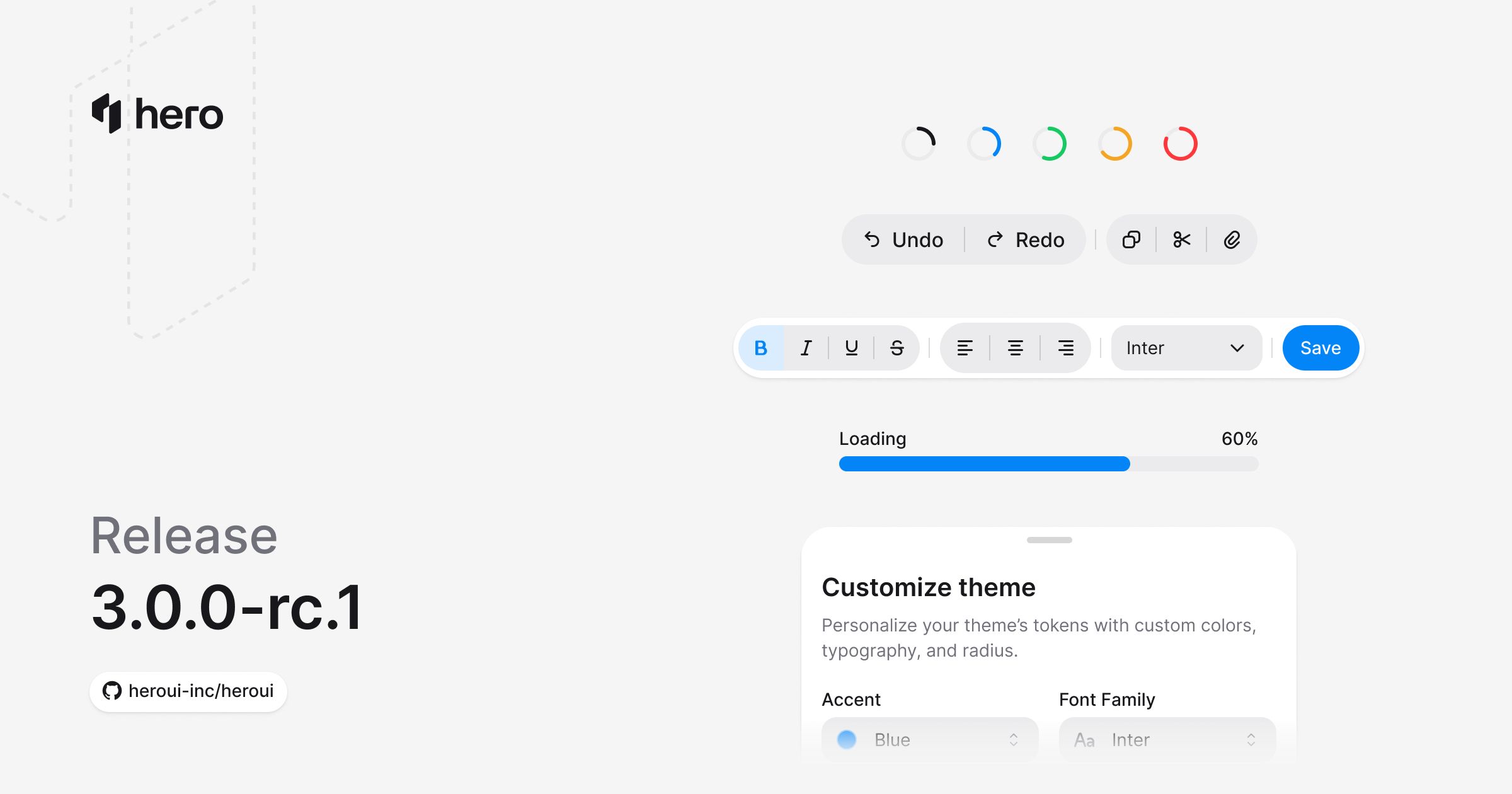
This release introduces 7 new components → Drawer, ToggleButton, ToggleButtonGroup, Meter, ProgressBar, ProgressCircle, and Toolbar. It also brings virtualization to Table and ListBox, a new ButtonGroup Separator sub-component with vertical orientation support, granular per-component subpath imports, and upgrades React Aria Components to v1.16.0.

Release notes: https://v3.heroui.com/docs/react/releases/v3-0-0-rc-1

New components

  • Drawer — slide-out panel with drag-to-dismiss, 4 placements (top/bottom/left/right), backdrop variants, and full compound composition

  • ToggleButton — stateful toggle with all button variants, icon-only mode, controlled or uncontrolled

  • ToggleButtonGroup — single or multi-select toggle group, attached/detached layouts, vertical orientation, and Separator sub-component

  • Meter — value within a known range (disk usage, password strength, quotas) with Track and Fill composition

  • ProgressBar — linear progress with determinate + indeterminate states, color variants, and custom value display

  • ProgressCircle — circular SVG progress with customizable TrackCircle and FillCircle sub-components

  • Toolbar — groups buttons, toggle buttons, and separators with horizontal or vertical orientation

Improvements and fixes

  • Table & ListBox virtualization — render 1000+ rows via React Aria's Virtualizer, TableLayout, and ListLayout (re-exported from @heroui/react)

  • ButtonGroup Separator sub-component + vertical orientation + inset focus rings

  • Granular per-component subpath imports (import { Button } from "@heroui/react/button")

  • ButtonGroup root upgraded from <div> to React Aria's Group for proper role="group" semantics

  • React Aria Components upgraded from v1.15.1 to v1.16.0

  • @internationalized/date upgraded from v3.11.0 to v3.12.0

  • InputGroup focus styles scoped to actual input/textarea focus

  • Avatar fallback now inherits border-radius from parent

  • Modal & AlertDialog backdrop clicks no longer propagate through portals

  • Table header rounding and background color fixed in Firefox

Upgrade with AI (recommended)

If you use AI tools like Cursor or Claude Code, upgrading is straightforward.

Install either MCP or Skills:

Then, just prompt: "Update HeroUI to the latest version" Your assistant can compare versions, update imports, and refactor code automatically.

Full changelog: https://v3.heroui.com/docs/react/releases/v3-0-0-rc-1

Stable is next. We're ready. 🚀

Talk soon, The HeroUI Team

New

HeroUI v3 beta.8

We're excited to share that HeroUI v3.0.0 beta.8 is now live.

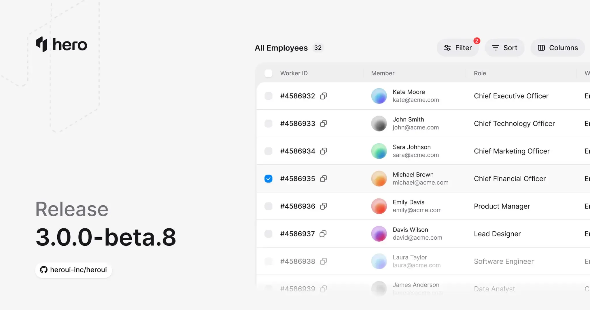
This release introduces 3 new components → Badge, Pagination, and Table. Table was one of the most requested components — it ships with sorting, row selection, column resizing, async loading, and footer composition out of the box.

Beta.8 also adds a new InputContainer composition API for DateField and TimeField, fixes required/invalid state handling across date and select components, and continues tightening APIs as we close in on stable.

Release notes: https://v3.heroui.com/docs/react/releases/v3-0-0-beta-8

Improvements and fixes

  • Badge — counters, labels, and anchored overlays with Badge.Anchor and Badge.Label

  • Pagination — composable primitives with summary, ellipsis, and previous/next controls

  • Table — sorting, selection, resizing, async loading, and footer composition

  • New InputContainer sub-component for DateField and TimeField prefix/suffix layout

  • RangeCalendar rounded corners for range selection visuals

  • DatePicker and DateRangePicker now show required-state red asterisk

  • Fixed invalid trigger styling in Autocomplete and Select

⚠️ Breaking changes

As we finalize APIs, this release includes breaking changes focused on stability and long-term clarity. TextField CSS classes were renamed from .text-field to .textfield (including file paths and export paths). We recommend reviewing the release notes before upgrading.

Upgrade with AI (recommended)

If you use AI tools like Cursor or Claude Code, upgrading is straightforward.

Install either MCP or Skills:

Then, just prompt: "Update HeroUI to the latest version" Your assistant can compare versions, update imports, and refactor code automatically.

Full changelog: https://v3.heroui.com/docs/react/releases/v3-0-0-beta-8

We're almost done with v3 — stable release is right around the corner.

Thanks for testing and sharing feedback. 🚀

Talk soon, The HeroUI Team
New

Earlier updates